THE STREET DOG COALITION
MOBILE & DESKTOP REDESIGN

Responsibility
-
User Research
-
Ideation
-
Prototyping
Tools
-
Figma
-
Google Suite
-
Zoom
-
Trello
-
Photoshop
-
Quicktime
Project Overview
In a team of four, we were tasked with selecting a nonprofit and executing the full UX/UI design process. Using the double diamond design thinking model, we collaborated to identify user needs, ideate solutions, and create a high-fidelity responsive web design (RWD) prototype in Figma. Our goal was to deliver a functional, clickable UI prototype that effectively addressed the nonprofit’s requirements and improved the overall user experience.
Problem, Solution & Impact
Problem
The Street Dog Coalition is a non-profit organization dedicated to providing free veterinary care to homeless pets and people experiencing homelessness.
While the mission and motivation of the organization resonate well with the audience, the website currently has several weaknesses that hinder user engagement and effectiveness.
Solution
We believe that redesigning The Street Dog Coalition website to enhance navigation, enrich content, increase engagement, and modernize design will improve user experience. This will lead to increased user satisfaction, higher engagement rates, and more donations and volunteer sign-ups.
Impact
Reduced the time users spent searching for the donation button by 8 seconds and locating featured programs by 10 seconds through strategic design improvements. By incorporating engaging colors and a unique brand design, I not only enhanced the overall user experience but also increased user engagement rates, creating a more marketable and visually appealing UI for the nonprofit.
User Research
Our comprehensive user research included developing personas and storyboards, conducting surveys, performing heuristic evaluations, and conducting a competitor and SWOT analysis. We used card sorting to create a sitemap, developed UI style tiles for mobile and web, mapped user flows, conducted usability tests, and proceeded with mobile and website redesigns. The process culminated in detailed next steps and reflections.
Target Audience
Our research, including outreach to The Street Dog Coalition's founder and employees, revealed two primary audiences for the website: volunteers/donors and those needing help. While most visitors are volunteers or donors, it is essential to design the site to be accessible and informative for those seeking the services The SDC offers. These users often access the site through communal library computers and similar resources.

Competitive Analysis
We conducted a competitive analysis to evaluate Street Dog Coalition's competitors, helping us identify their strengths and weaknesses in relation to our own business. By gathering information on both direct and indirect competitors, we can better understand the target market and its needs, identify potential threats, and discover gaps in products and services. This analysis also reveals opportunities for gaining a competitive advantage, allowing us to stay ahead of trends and effectively plan our product development. Ultimately, it provides valuable insights into common themes in user interfaces and features that contribute to a user-friendly and engaging website.

Unique Features
-
User-Friendly Navigation: A clear and intuitive navigation system is essential for enhancing user experience. Websites should have a well-structured header navigation that is easy to understand, minimizing any potential overwhelm from a wide range of services.
-
Prominent Donation Options: A visible and easily accessible donation button is crucial for nonprofit organizations. This feature should stand out on the homepage and throughout the site, facilitating quick and effortless contributions from users.
-
Engaging Visual Content: High-quality, impactful imagery that evokes positive emotions can significantly influence user engagement and donation behavior. Websites should utilize heartwarming images rather than solely focusing on alarming or sad visuals to encourage support.
-
Responsive and Dynamic Event Pages: Well-organized pages for events and volunteer opportunities should include filtering options and calls to action. This feature makes it easy for users to find relevant ways to get involved, fostering a sense of community and encouraging participation.
-
Inclusivity Features: Options such as language changes at the top of the navigation can enhance accessibility for diverse user groups. This feature is particularly valuable for organizations operating in multi-state environments or serving varied demographics.
Qualitative Research
We conducted ten surveys to gather insights for redesigning The Street Dog Coalition's website. The surveys aimed to understand user preferences for donating cash versus time, identify methods that encourage donations or tips, and explore personal experiences that inspire volunteerism. The feedback will guide us in making the website more user-friendly and visually appealing for its visitors.

Screeners
-
Experience with Nonprofits: "Have you ever interacted with or used a website for a nonprofit organization? If yes, please describe your experience."
-
Familiarity with Services: "Are you familiar with The Street Dog Coalition or similar organizations that provide veterinary care to homeless pets?"
-
Access to Technology: "Do you primarily access websites using a computer, smartphone, or other device? Please specify."
-
Purpose of Use: "What is your primary intent when visiting a website like The Street Dog Coalition? Are you looking for information about the nonprofit's mission, or are you interested in donating money or time?"
KEY FINDINGS

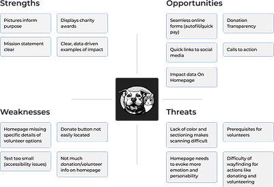
SWOT ANALYSIS

Pain Points
1. Donation button location
The donation button is currently located at the bottom of page. It is also located in the navigation where it blends in with other links around the site.
2. Volunteer Sign up Buried in Nav
Unlike the donate button at the bottom of the page- the volunteer buttons are presented as links on the home page and in the nav. This presentation does not encourage the same call to action as a button would.
3. UI Makes Scanning Difficult
The UI of SDC is black and white currently. While effective use of white space is often an advantage, it can also create a disorganized separation of information. The pages on the site are not sectioned in a way that is easy for users to scan.
Persona
We created Scott, our user persona. Scott is similar to our proto-persona but has all the grouped qualities from our interviews, surveys and data analytics. Once we gathered all of our research and defined the problem, we were able to brainstorm what features and modifications would most benefit our users, and then translate that experience emotionally through our user journey map and storyboard.


User Insight & Problem Statement
To capture what we wanted to achieve with our redesign, we came up with this as our user insight statement:
"Scott needs a streamlined sign up process for volunteering because he has volunteered many places and does not enjoy the monotony of filling info in."
After a few iterations, we identified the issue to be:
"Scott wants to volunteer at The Street Dog Coalition non-profit because they provide aide to both homeless people and animals. During user interviews, we discovered mixed reviews from users regarding the effectiveness of the site. Therefore, we believe that improving the information architecture, imagery, and navigation will help to increase donation and volunteer efforts. We might do this by creating a case study and testing out different value propositions. Doing this will afford the site more traffic."
We created a storyboard featuring Scott, who uses the SDC website to find an opportunity to volunteer. Our journey map shows his emotional ups and downs while using the website to apply for a volunteer position. With specific features and journey defined, we began building our prototype.


WIREFRAMES & PROTOTYPE
After finalizing the user flow, we transitioned to wireframe sketches where we outlined the key features and functionality of our website using the optimized user flows. We each created a brand mood board to inspire our redesign and drew sketches of each wireframe page we would need from our user flow.
Below is the mood board and a few of the sketches I made for the wireframes.

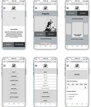

Mid-Fidelity Wireframes & Explanation
We combined sketches into an ideal wireframe flow and created digital wireframes using Figma. Through iterations, we developed a final clickable mid-fidelity prototype. We updated wireframes based on feedback from usability tests and conducted additional tests.
Below is the final mid-fidelity prototype. Despite challenges, our group enjoyed working together on The Street Dog Coalition UI Redesign Project together and achieved impressive results in researching, defining, prototyping, and testing the website. The feedback we received through mid-fidelity testing was key to our successful redesign.

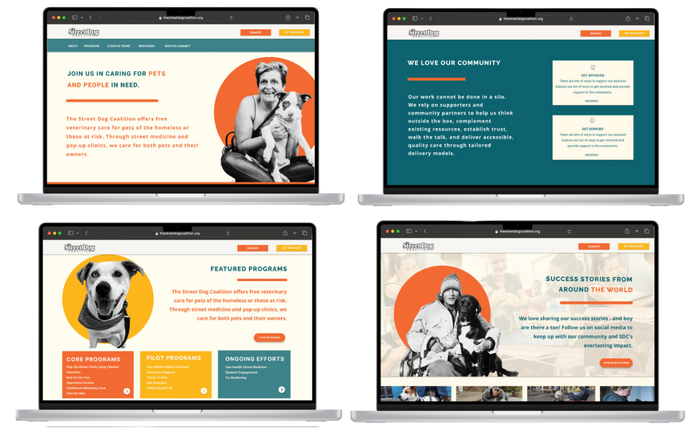
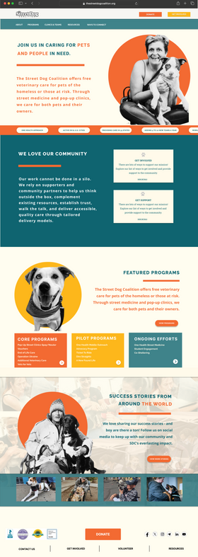
Home Page Wireframes
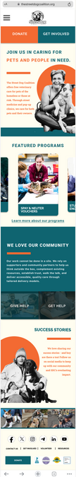

Created a header section for the mobile menu and logo.
Added pictures and bright colors to create a more positive atmosphere and encourage brand awareness.

Donate and Get Involved buttons track on the screen as the user scrolls.
Programs are featured on the homepage to attract volunteer interest and promote understanding of the program’s purpose.

Give Help and Get Help buttons implemented on the home screen to offer resources for both volunteers and those looking to use SDC services.
Success Story section to add an uplifting and personal feel to the Home Screen as well as demonstrating the non-profit’s emphasis on strengthening community.

Clickable slides of success stories
Reconstructed footer with clear links to socials, quick links, non-profit awards received, and a final donate button.
Donation Pages

-
Uplifting photo integrated throughout the donation wireframes to affirm the donators positive contribution to the SDC cause.
-
Quick donation process features: quick pay and donation amount options to ensure the process is as efficient as possible.
-
30 % of survey respondents prefer amount options when donating and 40% of respondents prefer automatic payment options
-
Volunteer Form

-
2-page volunteer form to ensure an efficient promise
- Incorporated a breadcrumb trail so users are aware of how long the form is and the time it will take.
- Form completed pop-up for to affirm completion & inform users of the next steps.

High-Fidelity Wireframes & Explanation