_edited.jpg)
Project Overview
The aim of this collaborative team case study was to revitalize the outdated U.S. Fish and Wildlife Service website by leveraging user research and a deep understanding of information architecture to create a more efficient, organized browsing experience across desktop and mobile. The project also highlights skills in visual design, interaction design, and user testing to deliver a cohesive, user-centered redesign.
Problem, Solution & Impact
Problem
The U.S. Fish and Wildlife Service (USFWS) website serves as a critical resource for sharing environmental conservation efforts, wildlife programs, and regulations. However, the site currently struggles with usability issues that impact both public and internal users, such as researchers, volunteers, and visitors seeking up-to-date information.
While the mission and motivation of the organization resonate well with the audience, the website currently has several weaknesses that hinder user engagement and effectiveness.
Solution
Our collaborative team embarked on a five-week design challenge to revitalize the outdated USFWS website. By focusing on user research, information architecture, visual design, and user testing, we aimed to develop a more organized and user-friendly experience across both desktop and mobile platforms.
Impact
-
Reduced time spent searching for key pages by 12 seconds on average through improved navigation and streamlined architecture.
-
Enhanced filter usability, reducing search time for events and articles by 9 seconds and significantly improving user satisfaction.
-
Increased engagement rates through a visually appealing design that incorporates engaging colors, meaningful visuals, and optimized layouts.
Responsibility
-
User Research
-
Ideation
-
Prototyping
Tools
-
Figma
-
Google Suite
-
Zoom
-
Trello
-
Photoshop
-
Quicktime
User Research
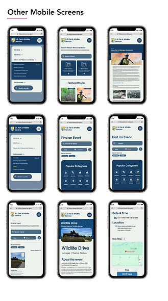
Our comprehensive user research included developing personas and storyboards, conducting surveys, performing heuristic evaluations, and conducting a web and navigation analysis. We used card sorting to create a sitemap, developed UI style tiles for mobile and web, mapped user flows, conducted usability tests, and proceeded with mobile and website redesigns. The process culminated in detailed next steps and reflections.
Target Audience
Our research revealed two primary audiences for the website: Fishers/Fishing Guides and teachers of US marine life. Those who fish may use the site for permits, seasonal legal information, or to obtain conservation information and fundraisers for their local community. Teachers may use the site for a multitude of reasons: educational information, community service events, and USFAW scholarship/educational partnership information.


Heuristics Evaluation
The user research for the U.S. Fish and Wildlife Service (USFWS) website redesign involved various methods, including developing personas, storyboards, conducting surveys, heuristic evaluations, and web navigation analysis.
The heuristic analysis revealed several areas for improvement:
-
Appearance and Aesthetics: Issues with inconsistent design, ineffective use of white space, and text and colors that lacked clarity.
-
Content: The website was difficult to scan, with unclear terminology and redundant information. Important content was not always placed above the fold.
-
Navigation: There were inconsistencies in navigation, with some users struggling to identify their location and find their way back to key pages.
-
Functionality: Issues included broken links, missing login clarity, and inconsistent user feedback for search status and form inputs.
The findings highlight the need for a more organized, visually appealing, and user-friendly experience to enhance usability and accessibility.

Qualitative Research
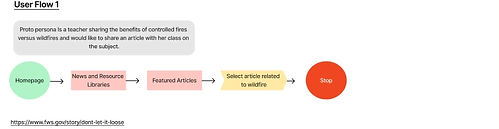
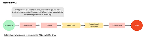
For our research, we began by analyzing the current FSW site using LATCH principles. Through preliminary user testing we uncovered pain points that arose when performing tasks on the current site. After creating user personas we designed a task flow diagram that fit their respective backgrounds. This research, that centered around improving information architecture for way-finding and strategic placing of the government services for the users, informed our final design for the new site.
Usability Testing

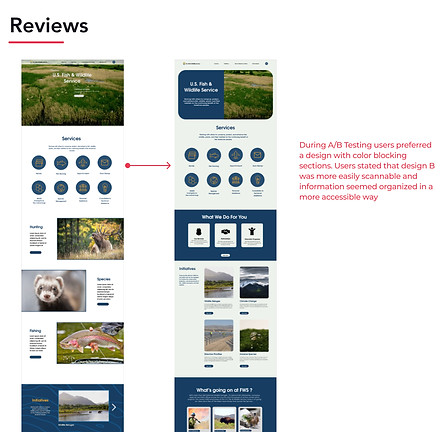
Results
-
53% Success rate for completing task on the original site. Most users were able to find the specified article but struggled using the navigation to locate the desired event.
-
98% Success rate of the user tasks when given the redesigned site, which focused on improving article search and event filters.
Website Analysis: LATCH
-
Category: Combine the Newsroom and Library into one streamlined database to reduce redundant search areas. Utilize existing filter categories (like State, Program, and Species) to enhance search functionality.
-
Hierarchy: Improve the content hierarchy by creating drop-down subcategories. Add filter bubbles for quick tag selection and enhance visual indicators with icons.
Time: Update the date format to align with modern design practices (e.g., the Bonjour Quebec website example). -
Additional design improvements: include switching to a clean and modern font and integrating more engaging images from the FWS resource library to create a more interactive and user-friendly experience. These enhancements aim to streamline the search process and improve usability across the platform.


Pain Points
1. Information Architecture
As a government website, the USFAW site contains an abundance of information. Currently, this information is not organized to maximum efficiency. Some pages have multiple pathways while others are buried in the navigation.
2. Events/News filters
Looking up events and news articles is currently lacking efficiency. Adjusting the presentation of the filter system for this content will improve the user experience.
3. UI Makes Scanning Difficult
Currently, the USFAW site is difficult to scan due to the amount of information the service wishes to provide. The content is repetitive and disorganized- it should be sectioned in a more defined manner.
Persona
We created Phil, our user persona. Phil is similar to our proto-persona but has all the grouped qualities from our user research. Once we gathered all of our research and defined the problem, we were able to brainstorm what features and modifications would most benefit our users, and then translate that experience emotionally through our user journey map and storyboard.


User Insight & Problem Statement
To capture what we wanted to achieve with our redesign, we came up with this as our user insight statement:
"Scott needs a streamlined sign up process for volunteering because he has volunteered many places and does not enjoy the monotony of filling info in."
After a few iterations, we identified the issue to be:
"Scott wants to volunteer at The Street Dog Coalition non-profit because they provide aide to both homeless people and animals. During user interviews, we discovered mixed reviews from users regarding the effectiveness of the site. Therefore, we believe that improving the information architecture, imagery, and navigation will help to increase donation and volunteer efforts. We might do this by creating a case study and testing out different value propositions. Doing this will afford the site more traffic."
We created a storyboard featuring Scott, who uses the SDC website to find an opportunity to volunteer. Our journey map shows his emotional ups and downs while using the website to apply for a volunteer position. With specific features and journey defined, we began building our prototype.

Wireframes & Prototype


Mid-Fidelity Wireframes & Explanation
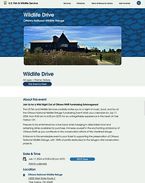
We combined sketches into an ideal wireframe flow and created digital wireframes using Figma. Through iterations, we developed a final clickable mid-fidelity prototype. We updated wireframes based on feedback from usability tests and conducted additional tests.


High-Fidelity Wireframes & Explanation